


DevKit – Developer Tools for WordPress
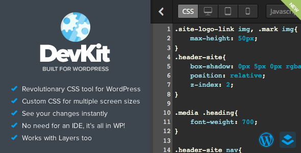
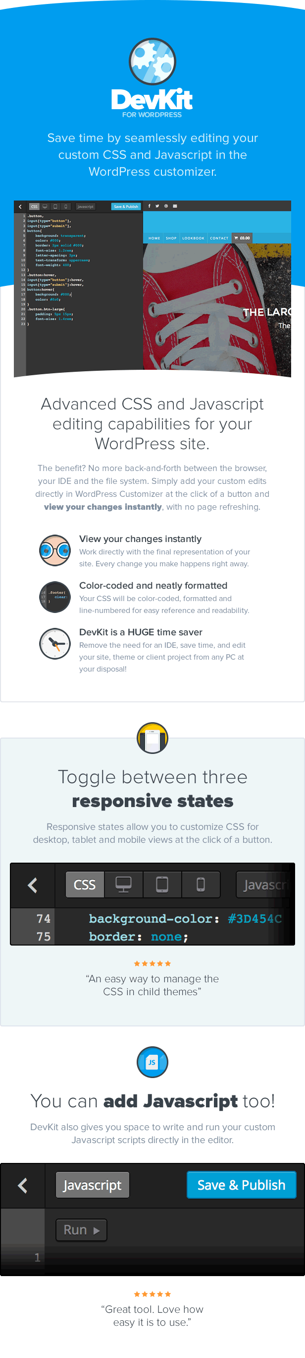



DevKit gives you advanced CSS and Javascript editing capabilities for your WordPress site.
The benefit? No more back-and-forth between the browser, your IDE and the file system. Simply add your custom edits directly in the
customizer at the click of a button and view your changes instantly, with no page refreshing.
-
View your changes instantly
Work directly with the final representation of your site. Every change you make happens right away. -
Auto-code formatting
Your CSS will be color-coded, formatted and line-numbered for easy reference and readability. -
DevKit is a HUGE time saver
Remove the need for an IDE, save time, and edit your site, theme or client project from any PC at your disposal!
Toggle between three responsive states
Responsive states allow you to customize CSS for desktop, tablet and mobile views at the click of a button.
Not only that but you can also define the screensize breakpoints in the DevKit settings panel.
DevKit is compatible with everything WordPress
That’s right, the easiest way to edit a theme’s css and javascript is
now compatible with any WordPress theme and plugin on the market!
You can add Javascript too!
DevKit also gives you space to write and run your custom Javascript scripts directly in the editor.




Related Products


 Elite Author


| Last Update | July 20, 2017, 6:37 pm |
|---|---|
| High Resolution | Yes |
| Compatible Browsers | IE10, IE11, Firefox, Safari, Opera, Chrome, Edge |
| Compatible With | Layers WP, WooCommerce 2.4.x, Jigoshop 1.15.x, Gravity Forms 1.8.x, Gravity Forms, Easy Digital Downloads 2.0.x, Easy Digital Downloads, Aesop Story Engine, Bootstrap 3.x, Foundation 5 |
| Software Version | WordPress 4.4.2, WordPress 4.4.1, WordPress 4.4, WordPress 4.3.1, WordPress 4.3, WordPress 4.2 |

